Color is the first sight when children see a indoor playground,maybe it will effect the children’s mind, go to or not to play?So choosing the right color scheme for a kids’ indoor playground is very important.
So it’s important to know the Psychology of Colors:
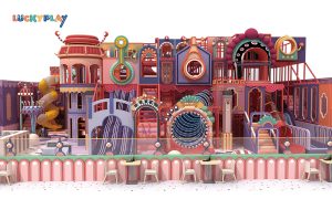
- Red: Energizing and stimulating, but too much can be overwhelming.
- Blue: Calming and soothing, great for relaxation areas.
- Yellow: Cheerful and uplifting, but use sparingly to avoid over stimulation.
- Green: Natural and calming, promotes a sense of balance.
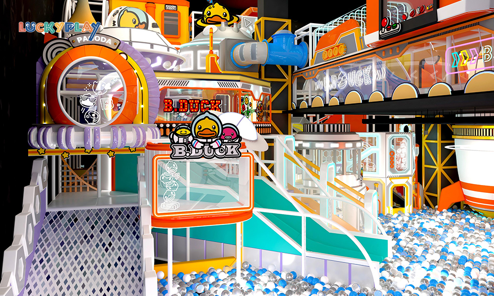
- Orange: Friendly and inviting, encourages social interaction.
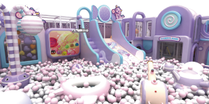
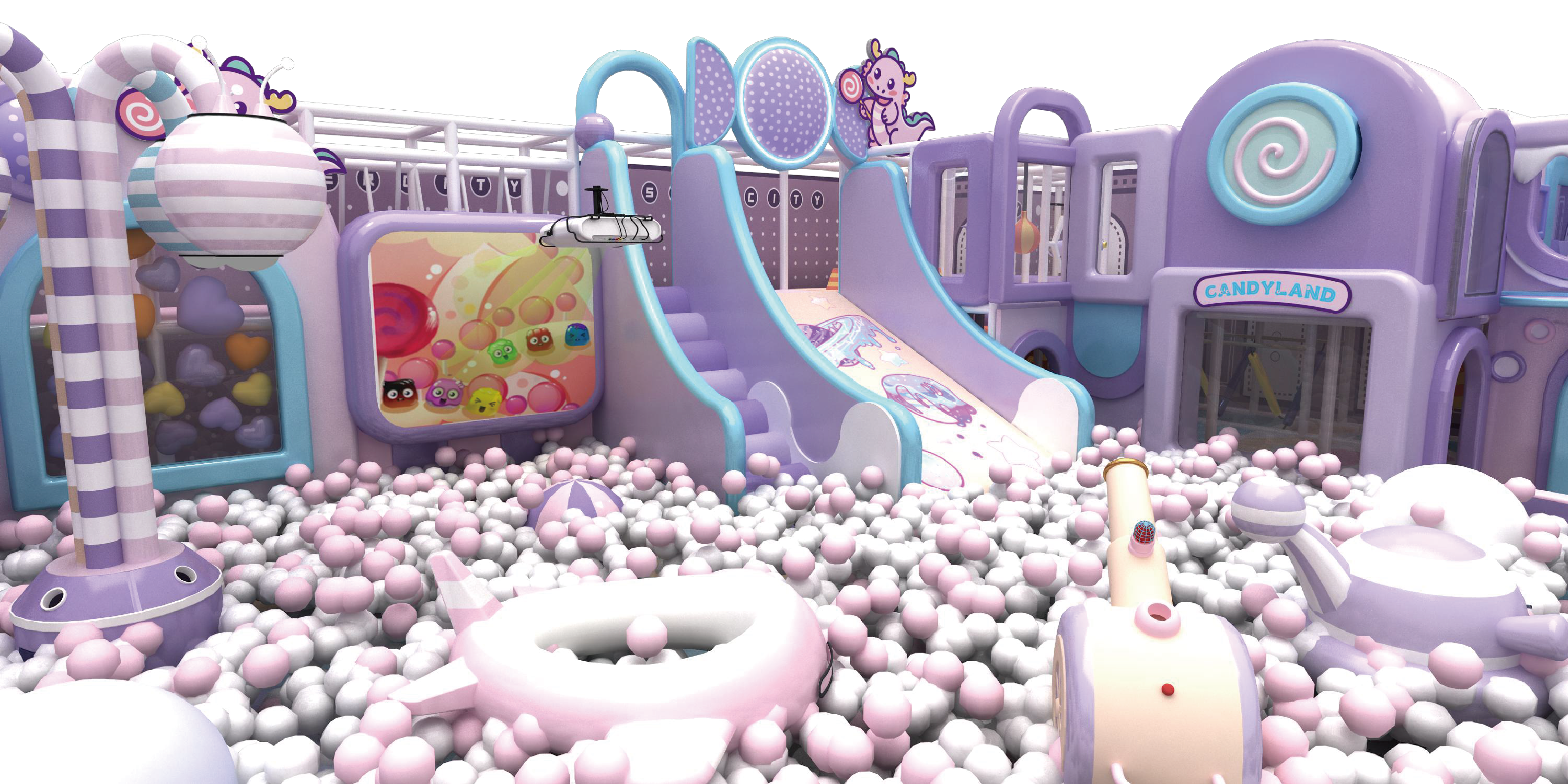
- Purple: Creative and imaginative, ideal for play areas.
- Pink: Soft and comforting, often associated with nurturing.
2. Consider the Age Group
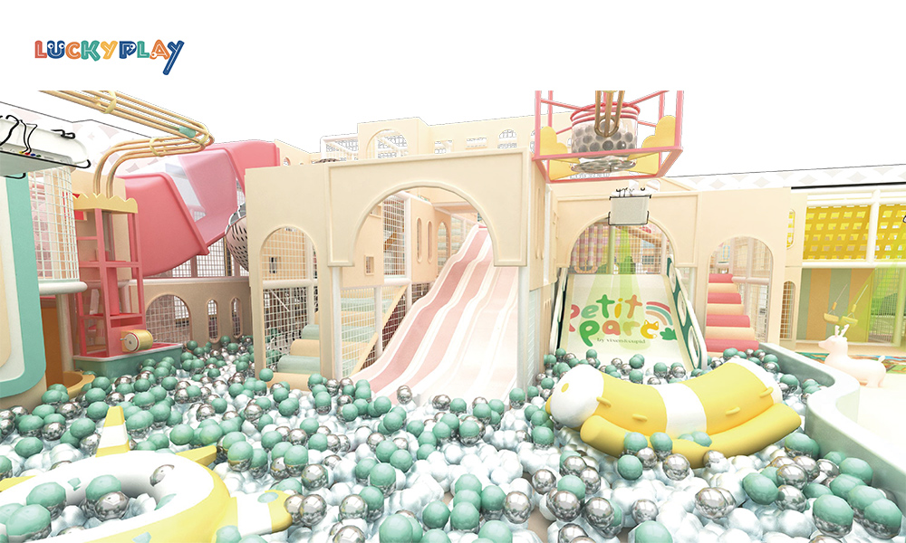
- Toddlers (1-5 years): Use soft, pastel colors like light blue, pale yellow, and soft pink to create a calming environment.
- Older Kids (5-13 years): Vibrant and bold colors like orange, green, and purple can be exciting and fun.
3. Balance Bright and Neutral Colors
- Bright Colors: Use bright colors for play equipment and focal points to attract attention and stimulate activity.
- Neutral Colors: Use neutral tones like beige, gray, or white for walls and flooring to balance the overall look and prevent sensory overload.
4. Incorporate a Theme
- Nature Theme: Use greens, browns, and blues to create a natural, outdoor feel.
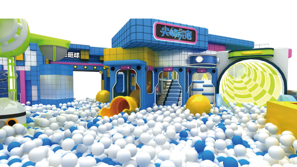
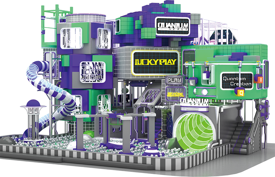
- Space Theme: Use blacks, blues, and silvers with pops of bright colors like yellow and orange.
- Underwater Theme: Use blues, greens, and purples to mimic an ocean environment.
- Jungle Theme: Use greens, browns, and yellows with animal prints and patterns.
You’d better to choose a cohesive color palette with 3-5 main colors.
Accent Colors: Use accent colors to highlight specific areas or features.
Contrast: Ensure there is enough contrast between colors to make the space visually interesting but not overwhelming.
5. Test the Colors
- Mockups: Create mockups or use design software to visualize the color scheme.
- Lighting: Consider how natural and artificial lighting will affect the colors. Test colors under different lighting conditions.
6. Safety and Maintenance
- Visibility: Ensure colors do not obscure safety signs or equipment.
- Durability: Choose colors that are easy to clean and maintain, especially in high-traffic areas.
7. Get Feedback
- Children’s Input: If possible, involve children in the color selection process to see what they prefer.
- Parent’s Perspective: Consider feedback from parents to ensure the colors are appealing and appropriate.
Example Color Schemes
- Primary Colors: Red, blue, and yellow for a classic, vibrant look.
- Pastel Palette: Soft pink, light blue, and pale yellow for a calming, nursery-like environment.
- Nature-Inspired: Green, brown, and beige with pops of orange for a natural, earthy feel.
- Modern and Bright: Bright orange, lime green, and electric blue for a contemporary, energetic space.
By carefully selecting a color scheme that aligns with the age group, theme, and psychological effects of colors, you can create an indoor playground that is visually appealing, stimulating, and enjoyable for children.